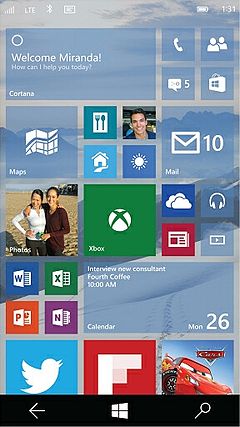
Personally, I'm a proud Lumia 520 owner. I'm here to talk about the actual design language the preview gives us a sneak peek of. As you know in Windows Phone 8.x, menus and general navigation was achieved by swiping left/right, and most other functions were located at a taskbar on the bottom. This navigation and organization system seems to have dramatically changed, much to the dismay of larger-screened users. Many of them feel Windows Phone 8 stood out from Android and iOS because most/all navigation was at the bottom, meaning even users with smaller hands could effectively use a monster device such as the Lumia 1520. Recent design changes in apps on WP8 such as OneDrive ignored this design, angering many users, and now Windows 10 for Phones has continued along that same path. Redesigned built-in apps such as Alarms, Calculator, and Photos have moved the navigation toolbar and menu to the top of the screen, making it hard to use for many on larger screens. Expected apps such as the Universal Office suite are also expected to have a similar design language.
However, there is hope. I believe Microsoft has made it clear the hamburger menu is here to stay in Windows 10. However, hamburger menus and top-based navigation aren't all bad. For one, they look good. For two, Microsoft may implement a navigation design quite popular among different apps and platforms. I am talking about being able to swipe in from the left of the screen to open the menu. iOS implements somewhat this language. The Spotify Windows Phone app also uses this. Overall, I'm not a huge fan of where the design of Windows Phone is going, but Microsoft could hit the right note for everyone and it could be a success. All in good time, I guess.
Comments
|
Windows 10The author of the Windows 10 Page Blog. Not much else to say about me. CategoriesArchives© 2015 Windows 10 Page. Office, Windows, and Windows Phone are registered trademarks of Microsoft. Lumia is a trademark of Microsoft.
|
 RSS Feed
